COMMERCIAL REAL ESTATE BRANDING
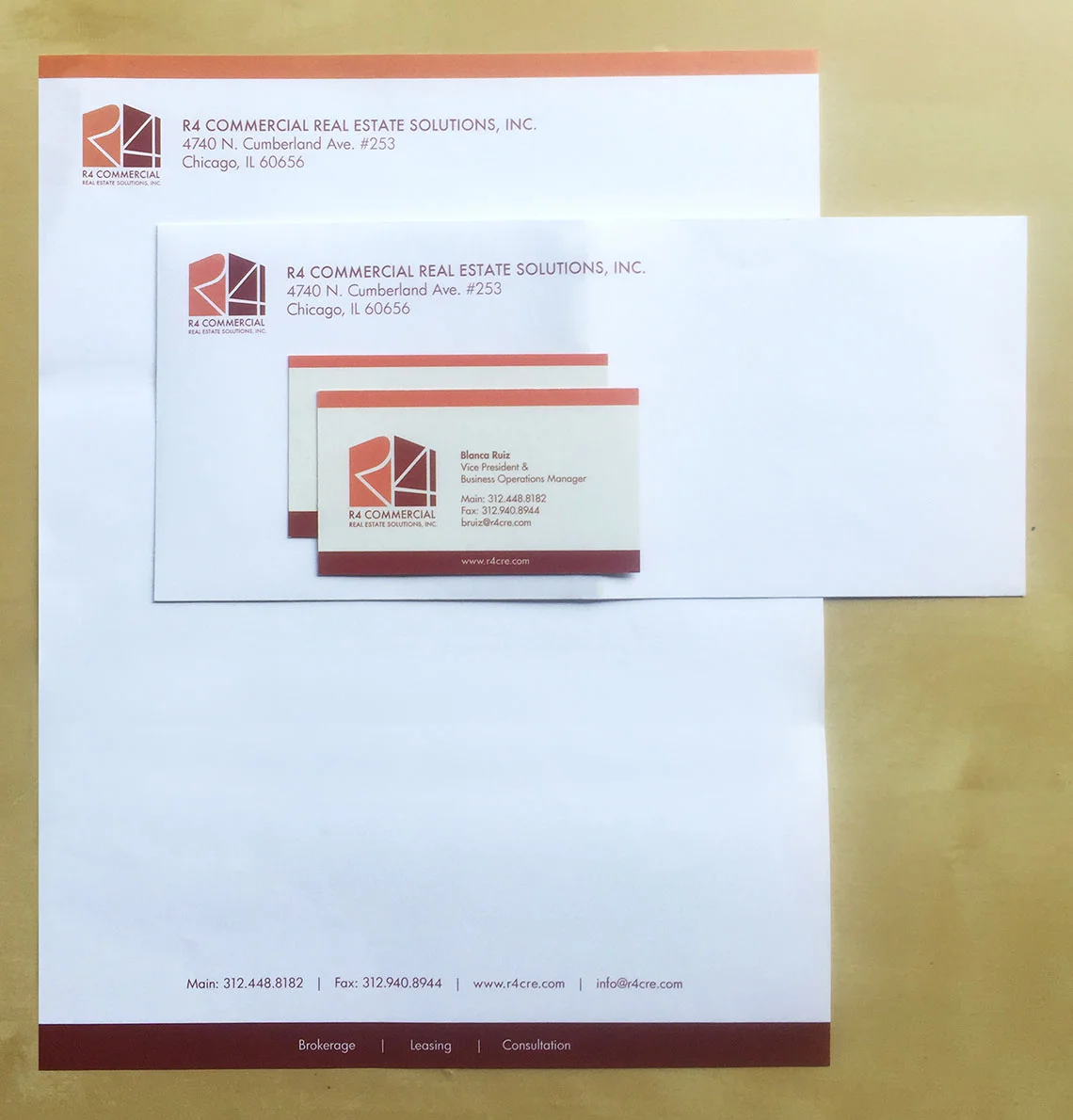
Branding is solid and sophisticated, reliable and approachable. The simple cube shape of the logo not only represents a building but reinforces R4 with four equal sides. Two-tone color of shadows on a building are carried throughout the branding.
BAKING COMPANY BRANDING
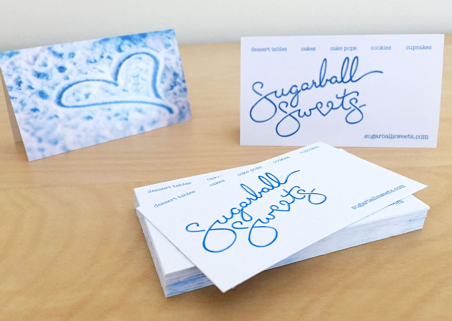
Branding needed both simplicity and fun for clients with children yet elegance for adult applications.
The hand-made nature of the business is carried through in a look mimicking dessert icing.
LUXURY BEDDING BRANDING
The branding needed a high-end luxury feel but also represent the unique technology within the product.
Clean bold lines convey the luxury feel, simple mathematic shapes convey technology.
Simple shapes further representing the internal structure of the material are used throughout the branding.
CONFERENCE BRANDING
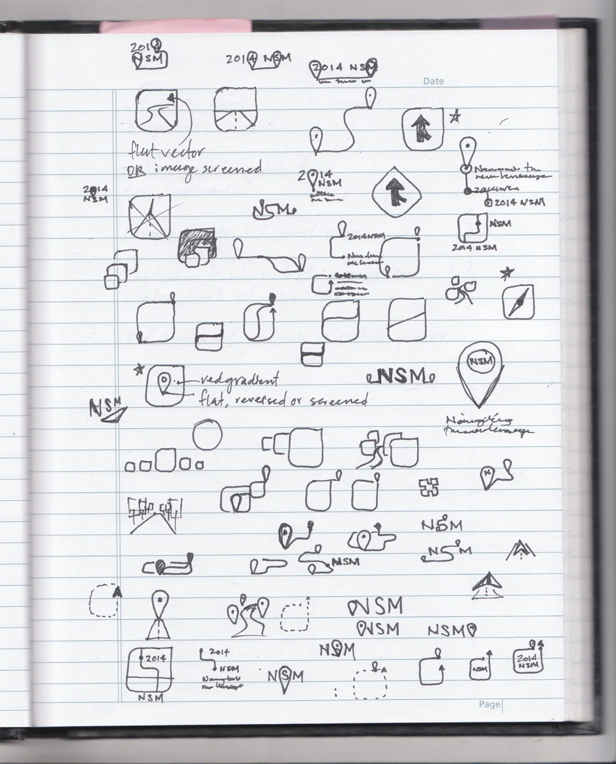
Needed a striking visual to represent the changing health care landscape and carry through the event theme of "Navigating the New Landscape".
The mark acknowledges a difficult road ahead for health care but also indicates a solution in sight. The flat, iconic branding has a nod to technology while fitting with established company branding.
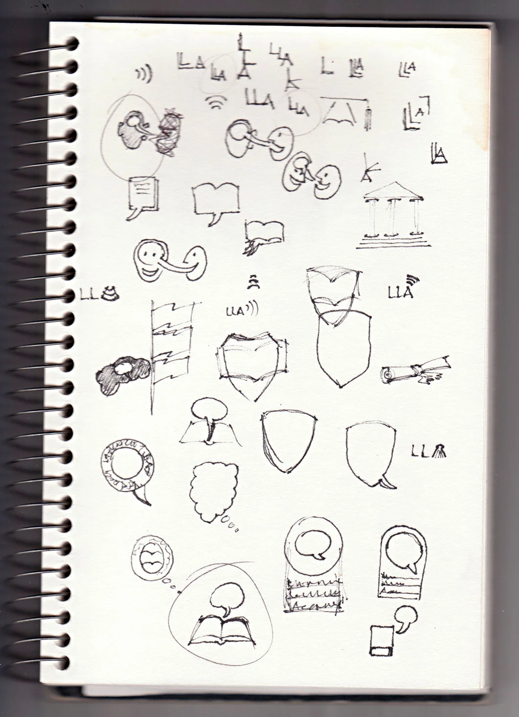
LANGUAGE SCHOOL BRANDING
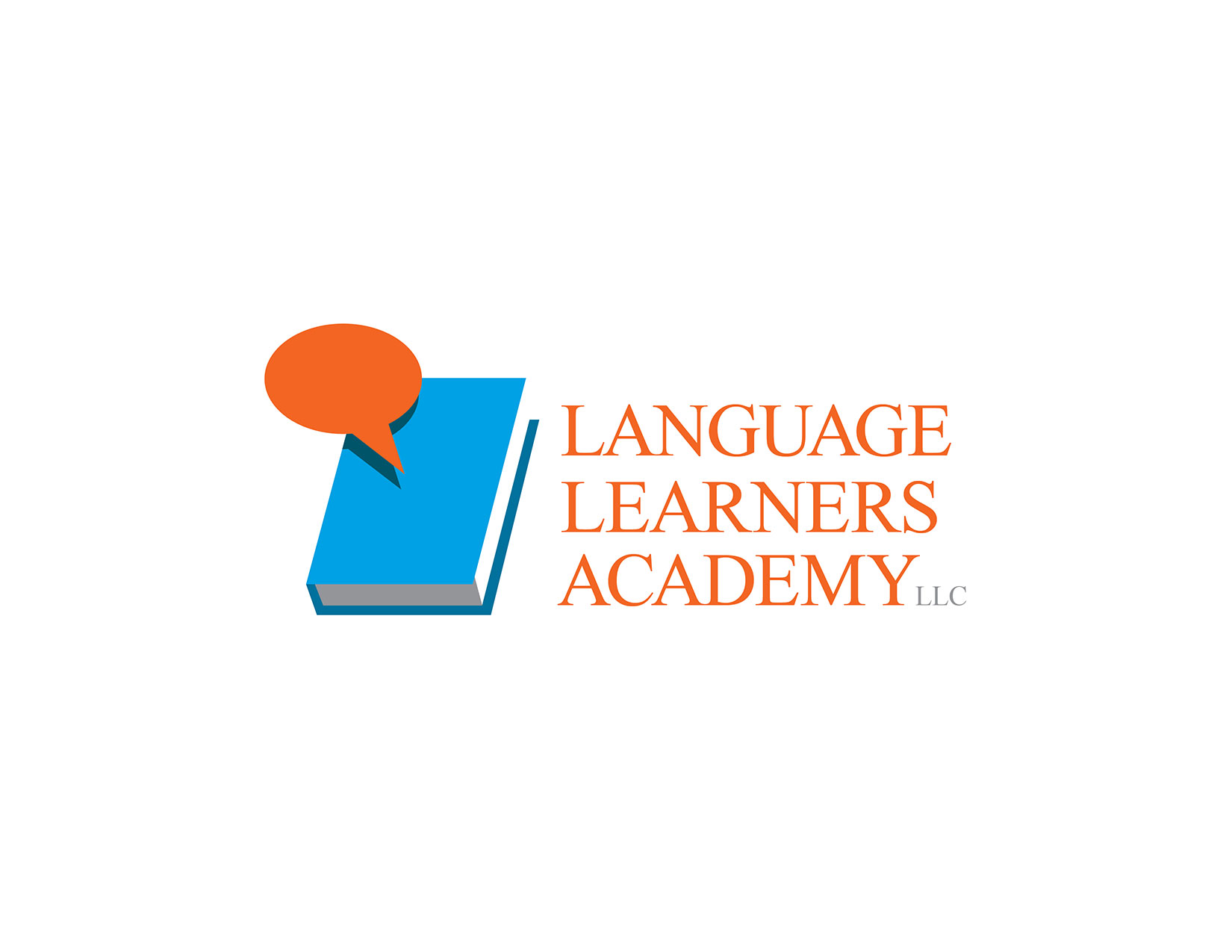
Branding for a new school needed to carry the solidity of an established institution, represented in classic typography.
A modern visual indicates their trend toward non-traditional learning methods.
